
A group of researchers from the University of Texas and the University of Houston have created a mapping tool for identifying which parts of the greater Houston area are at the greatest risk from COVID-19.
"The map offers a comparative look at vulnerabilities across Harris County, and could help policy makers determine how to allocate coronavirus tests and health and safety resources," says Amin Kiaghadi, a research associate at UT's Oden Institute for Computational Engineering & Sciences and postdoctoral fellow at the University of Houston, in a news release.
The study, which is posted on MedRxiv, looked into access to health care, pollutant exposure, and medical insurance coverage. Kiaghadi and two UH professors, Hanadi Rifai and Winston Liaw, concluded that the areas most at risk were in the east and northeastern parts of town — especially industrial areas and high-traffic waterways.
The research showed that the highest risk areas were identified as poorer communities, like the area near the Houston Ship Channel. Consequently, populations with lower risk are in the far west areas of Harris County, which tend to be considered nicer areas. According to the release, around 17 percent of the county's population falls into a risk category.
"I'm really interested to see how decision makers look at these maps," Kiaghadi continues. "They can say 'this specific area is vulnerable to many different things—people living there have lower income, they have or they don't have access to the medical care— and that can change the way that they distribute the resources."
Kiaghadi usually focuses on floodwaters spread contamination, and he postulates that his work in this field had an application within the pandemic.
"We believe that if you're exposed to some chemicals for a long time or you were living in an area with bad air quality, that can affect your immune system long term and then make you more vulnerable to a disease like COVID-19," Kiaghadi says. "So we decided to take a new approach here and show that these factors should be considered."
Based on census data, the map is divided up into 786 polygons and looks into 46 different variables in five categories:
- People with limited access to hospitals and medical care.
- People with underlying medical conditions.
- People with exposures to environmental pollutants.
- People in areas vulnerable to natural disasters and flooding.
- People with specific lifestyle factors, like obesity, drinking and smoking.
According to the release, the researchers formulated the map within just a couple weeks.
"We already had a lot of knowledge and experience working with this sociodemographic data, and population vulnerability to the flaws in the environment and exposure," Kiaghadi says. "So we felt like, this is totally related to our research, so why not explore what it means?"
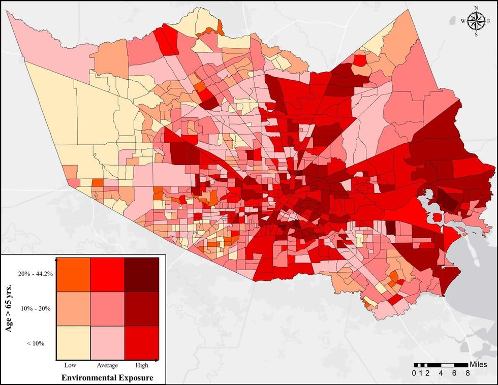 The map is broken down by 786 census tracts. Graphic via utexas.edu